



Getting more appointment requests through a healthcare website is a challenge many providers face. With patients increasingly turning to the internet to find and book medical services, your website must do more than just look professional. It needs to guide visitors smoothly toward scheduling an appointment. In this post, I’ll share practical strategies that improve healthcare website conversion optimization and help turn casual visitors into booked patients.

Make Navigation Simple and Intuitive
Visitors often leave websites quickly if they can’t find what they need. For healthcare websites, this means appointment booking options must be easy to locate and use. Here’s what works:
Clear menu labels: Use straightforward terms like “Book Appointment,” “Schedule Visit,” or “Contact Us.”
Sticky navigation: Keep the booking button visible as users scroll.
Minimal clicks: Reduce the number of steps to book an appointment. Ideally, it should take no more than 3 clicks.
Mobile-friendly design: Many patients use smartphones, so your site must look and work well on smaller screens.
Include these patient tasks in the website strategy brief so navigation is based on useful decisions rather than internal departments.
Build Trust with Clear Information
Healthcare decisions are personal and sensitive. Your website must build trust quickly to encourage appointment requests. Here’s how:
Show credentials and certifications: Display doctor qualifications and affiliations prominently.
Patient testimonials: Real stories from satisfied patients reassure visitors.
Transparent pricing: If possible, provide clear information about consultation fees or insurance accepted.
Privacy assurance: Include a visible privacy policy and explain how patient data is protected.
Compare practice details with Google’s local ranking guidance so public listings and the appointment page tell the same story.
Use Strong Calls to Action (CTAs)
A well-crafted call to action guides visitors toward booking. Here are tips for effective CTAs:
Use action words: “Schedule Your Appointment,” “Book Now,” or “Get Started Today.”
Make CTAs stand out: Use contrasting colors and larger buttons.
Place CTAs strategically: Include them at the top of the homepage, after service descriptions, and at the end of blog posts.
Create urgency: Phrases like “Limited slots available” or “Next appointment in 3 days” encourage faster decisions.
Scope a conversion optimization review around a successful appointment request and the response patients receive afterward.
Optimize Website Speed and Performance
Slow websites frustrate users and increase bounce rates. For healthcare providers, this means lost appointment requests. To improve speed:
Compress images without losing quality.
Use reliable hosting services.
Minimize the use of heavy scripts and plugins.
Enable browser caching.
Provide Multiple Booking Options
Different patients prefer different ways to book appointments. Offering several options can increase conversion:
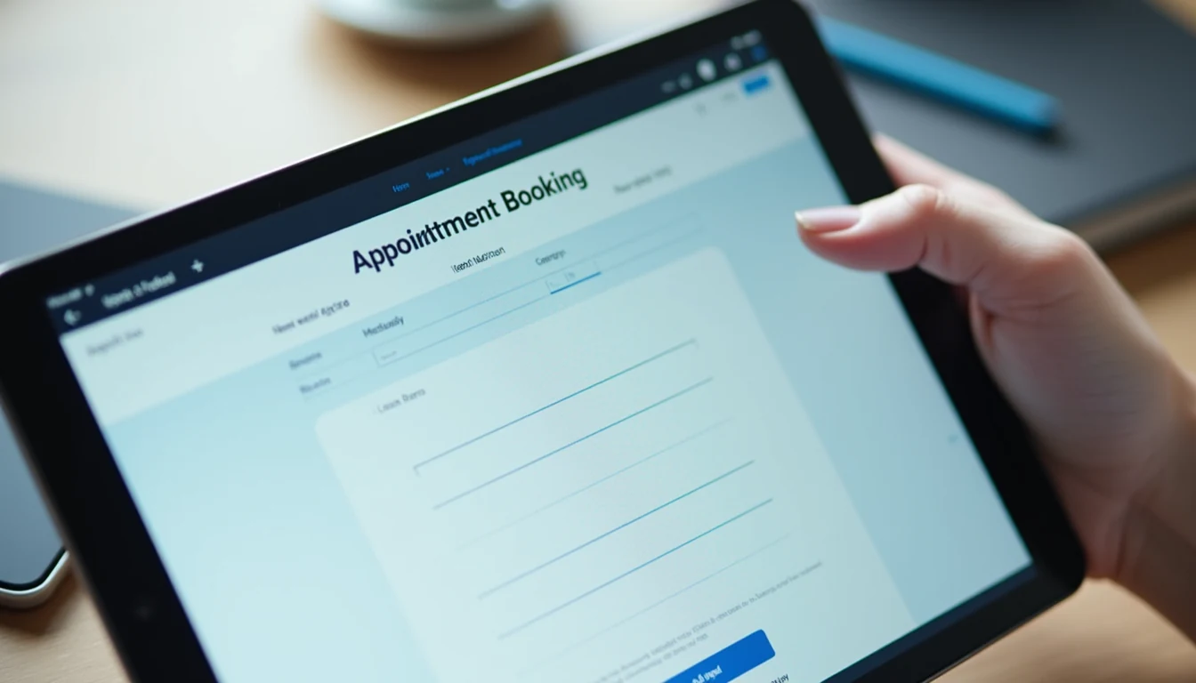
Online booking forms: Simple forms that collect essential information.
Click-to-call buttons: Allow mobile users to call directly.
Live chat support: Answer questions instantly and guide visitors to book.
Patient portals: For returning patients to schedule follow-ups easily.
Offering flexibility shows you understand patient needs and reduces barriers to booking.
Use Patient-Centered Content
Content that speaks directly to patient concerns builds connection and trust. Focus on:
Clear descriptions of services: Explain what patients can expect.
FAQs: Address common questions about appointments, insurance, and procedures.
Educational blog posts: Help patients understand health topics and your expertise.
Friendly tone: Write as if you are talking to a patient, not a medical professional.
This approach improves engagement and encourages visitors to take action.
Track and Analyze User Behavior
To improve healthcare website conversion optimization, you need data. Use tools like Google Analytics and heatmaps to see:
Where visitors click most.
Which pages have high bounce rates.
How long users stay on booking pages.
Drop-off points in the appointment process.
Regularly reviewing this data helps you identify problems and test improvements. For example, if many users abandon the booking form, consider simplifying it or adding progress indicators.
Ensure Accessibility for All Users
Healthcare websites must be accessible to everyone, including people with disabilities. Accessibility improvements include:
Using readable fonts and sufficient contrast.
Adding alt text to images.
Making the site navigable by keyboard.
Providing transcripts for videos.
Accessible websites reach a wider audience and comply with legal standards such as the Americans with Disabilities Act (ADA). Use W3C’s image alternatives guidance when checking whether visual information remains understandable without the image.
Separate an appointment request from a confirmed visit
A website should tell the patient exactly what the action means. “Request an appointment” is different from selecting a confirmed time in a scheduling system. Explain whether staff will call, how the person will be contacted, and whether availability still needs to be checked. An accurate confirmation reduces uncertainty and helps the practice avoid promising an appointment it has not actually scheduled.
Review the handoff with the scheduling team. Identify where the request appears, who checks it, and what happens when the preferred clinician or location is unavailable. Marketing conversion cannot be evaluated only at form submission. A practice may receive requests that never become appointments because the response process, capacity, or patient expectations do not match the website’s message.
Answer practical questions before asking for details
Patients often need basic information before they are comfortable making contact. Explain the location, services, clinician credentials, accessibility arrangements, and the process for checking accepted insurance. If participation varies by clinician or plan, say how the patient can verify it. Avoid an absolute statement that creates an expectation the scheduling team cannot confirm.
Organize information around common tasks. A new patient might need preparation instructions, a map, and a description of the first visit. An existing patient may need a different route for records or follow-up. Keep those journeys distinguishable. When the website makes the next step obvious, patients spend less effort determining whether a button is intended for their situation.
Reduce form friction without weakening privacy
Collect only the information needed for the appointment-request process and route it through the practice’s approved systems. A general marketing form should not casually invite a detailed medical history. Explain which information should be shared later through a secure channel and provide an appropriate alternative when a person cannot use the form. Include HHS’s tracking-technology guidance and court-order notice in the privacy review before changing analytics on patient-facing pages.
Review the form’s data flow, including third-party scripts and embedded tools, with the practice’s privacy and technical owners. Health-related interactions can create obligations that depend on the information and context. Do not treat a privacy-policy link or a vendor’s generic security statement as a complete assessment. Clear collection purposes and an understood handoff are part of a responsible booking experience.
Test the page with realistic patient tasks
Ask a reviewer to find a clinician, understand whether a service is offered, locate the practice, and begin an appointment request using a phone. Give the task without explaining where to click. Observe where they hesitate, which labels they misinterpret, and whether they can recover from an error. The objective is to identify friction in the experience rather than to persuade the reviewer that the design is easy. Use the Research Lab’s website-performance section as context for the review, then test the practice’s actual mobile appointment journey.
Include keyboard navigation and readable text in the review. Form controls need visible labels, understandable instructions, and error messages associated with the relevant field. Do not rely on color alone to communicate a required action. Images should have appropriate alternatives where they convey information. Accessibility review involves more than a single automated score; use the findings to guide specific improvements.
Choose conversion measures the practice can explain
Track the stages the practice can observe responsibly, such as submitted requests, completed scheduling contacts, confirmed appointments, and attendance where the operational systems support that reporting. Keep definitions consistent and restrict access to sensitive records. The marketing dashboard should not expose identifiable health information to people or systems that do not need it.
Compare similar services and time periods. A page for a service with limited availability may behave differently from a general primary-care page. Changes in staffing, hours, insurance participation, or scheduling capacity can affect outcomes independently of the design. Record those conditions before attributing a change to a new headline or button. Useful measurement helps the team understand the process rather than claiming certainty from a small sample.
A practical improvement sequence for a practice
Begin by testing the current request process from start to finish. Correct broken forms, inaccurate location details, and misleading confirmation language. Then review the highest-priority service pages and the questions patients ask before scheduling. Add clear answers and a relevant action near the point where the patient has enough information to proceed.
Review the result with clinical, administrative, and privacy stakeholders. The website team can improve clarity and interaction, but it should not independently invent clinical advice, insurance commitments, or privacy assurances. Assign a content owner for each service and establish a maintenance schedule. A healthcare website supports conversion when the information is accurate, the interaction is understandable, and the practice can deliver the experience described on the page.
Review the confirmation message as part of the design
Read the final confirmation from the patient’s perspective. It should state whether the request was received, what the next step is, and how to correct a mistake or use another appropriate contact route. Avoid implying that a consultation, clinician, or appointment time has been confirmed when staff still need to review availability. Make the message understandable without requiring another page visit.
Check the same language in automated emails and internal notifications. When those messages disagree, staff may spend their first conversation correcting expectations created by the website. Keep a version record and assign an owner for future changes so a revised form does not quietly restore an older, misleading confirmation.
Conclusion
Improving appointment requests on your healthcare website requires a clear focus on user experience, trust, and ease of use. By simplifying navigation, building trust with transparent information, using strong calls to action, and optimizing performance, you can increase conversions effectively. Offering multiple booking options and patient-centered content further supports visitors in making the decision to schedule. Finally, tracking user behavior and ensuring accessibility help maintain and improve your website’s success over time.
Start by reviewing your current website with these points in mind. Small changes can lead to significant improvements in healthcare website conversion optimization and ultimately bring more patients through your doors.